.png)


Understanding the MiniMedTM app Home Screen
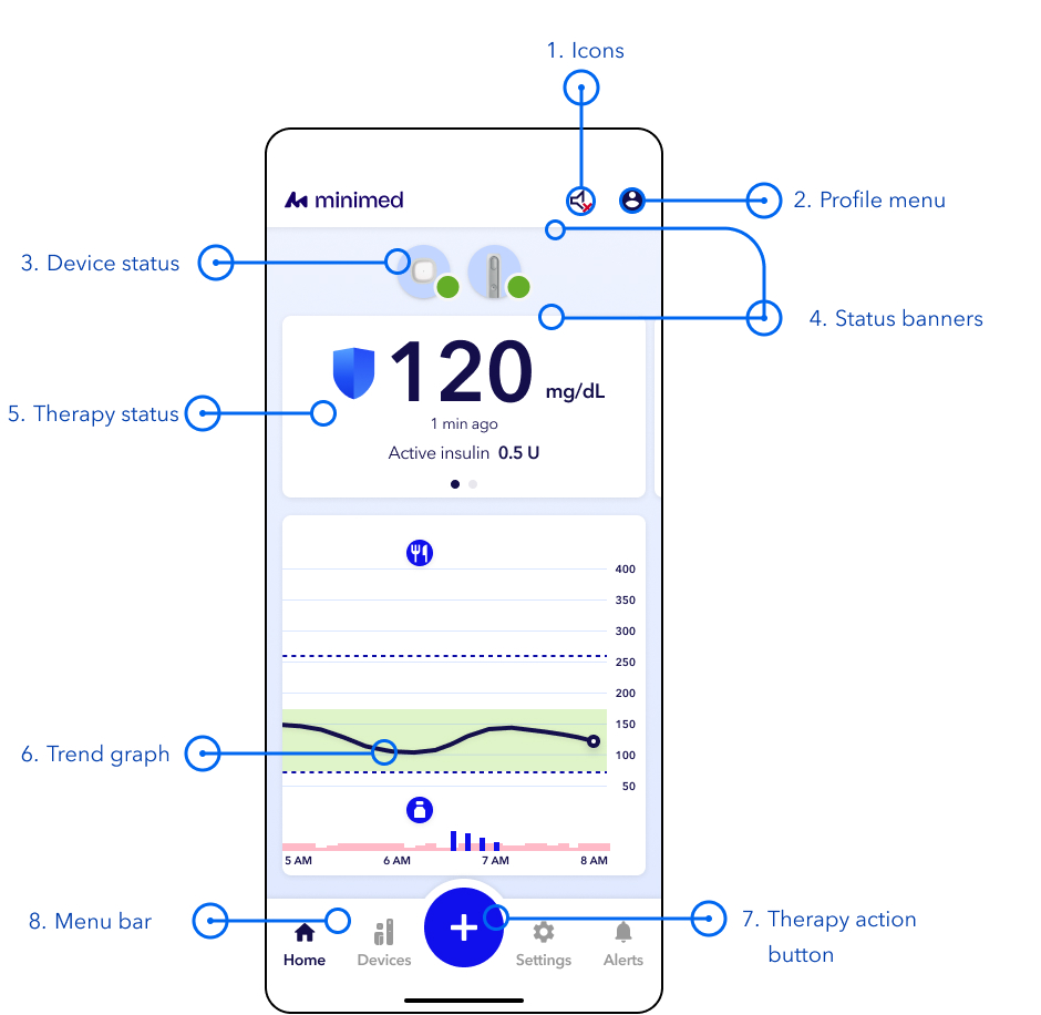
Overview
- Icons – Icons may appear in this location. Tap the icon on the screen to see more details.
See icon overview - Profile menu – View information such as CareLink, Daily history, Summary of therapy and sensor data, and the Help menu.
- Device Status – The following status icons may appear on the device icons. A number in the icon shows how many actions are needed. See more details
You may see multiple icons and numbers on the device icon at any time. This does not indicate that anything is wrong with the pump, it is simply notifying you that there needs to be an action (or multiple actions) taken.
- Status banner – Banners below the device icons show status information. Banners above the device icons show alerts that still need your response. Tap a banner to see more details and follow the steps if needed.
- Therapy Status – View your glucose and therapy information and swipe left for details about your products.
See more detail - Sensor trend graph – View the graph to see your glucose levels over time. You can tap on the icons for more information about events, such as insulin doses and carb entries.
See more detail - Action button – Access therapy actions such as the Bolus calculator, suspend delivery, or log an event.
- Menu bar – Access your device information, settings, and alert history.
See more detail
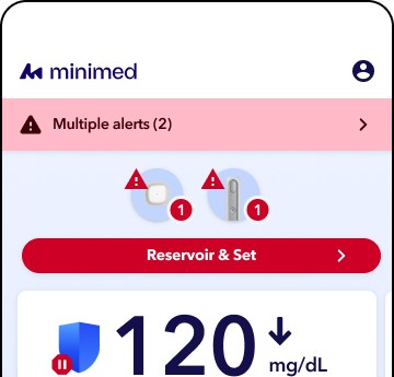
Image is for demonstration purposes only. Your screen may appear different based on individual settings
 No actions are needed at this time.
 An action is needed soon.
 An action is needed now.
 No communication between devices.
 An open alert requires an action now.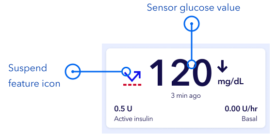
Note: The therapy status view differs when SmartGuardTM mode is active.
- Sensor glucose value — Displays glucose readings from your compatible sensor.
- Suspend feature icon — Indicates that Suspend before low or Suspend on low is turned on while in manual mode. In SmartGuard™ mode, this icon will be replaced with a blue shield
 .
. - Trend arrows — Show the direction and speed at which your sensor glucose values are changing.
- Active insulin time — Shows the amount of insulin from previous boluses that is still active in your body.
- Current basal rate (in manual mode only) — Displays the basal insulin rate currently running when in manual mode.
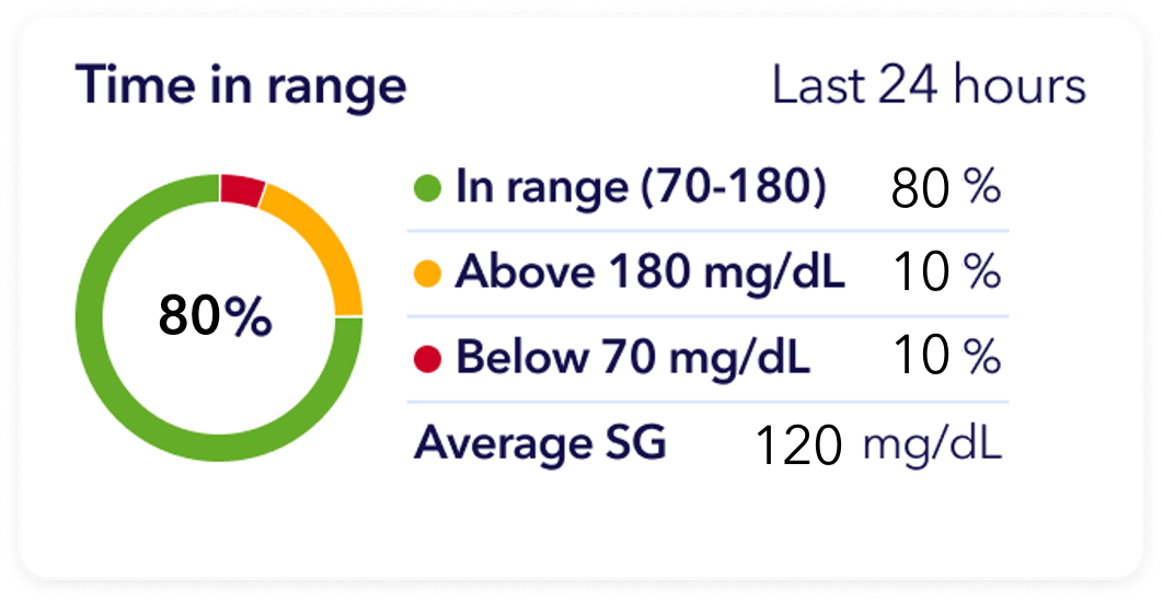
Image is for demonstration purposes only. Your screen may appear different based on individual settings
Swipe left on the Therapy status section for details about your Time in Range. The graph shows the percentage of time you spent in and out of the preset SG range of 70 to 180 mg/dL (this range cannot be changed).
- Orange— Time spent above 180 mg/dL during the past 24 hours.
- Green — Time spent between 70 and 180 mg/dL during the past 24 hours.
- Red — Time spent below 70 mg/dL during the past 24 hours.
Your average SG reading is show at the bottom of the screen.
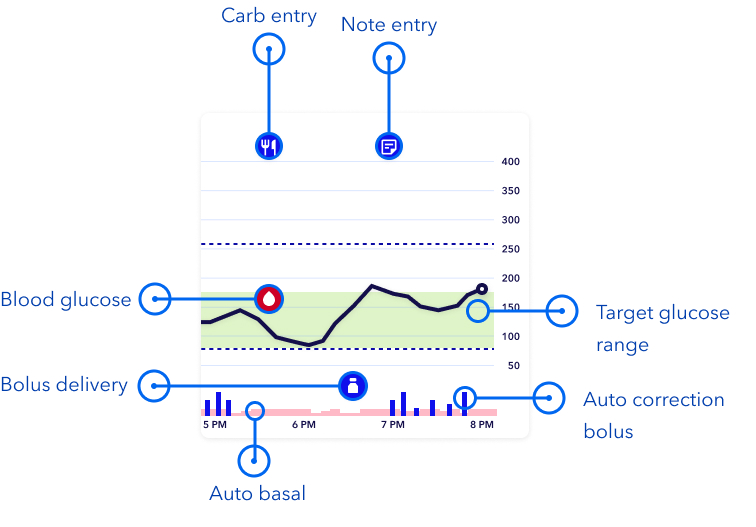
Trend graph with SmartGuardTM mode
The SmartGuardTM sensor graph includes the following information:
- Any icon on the graph can be tapped to view more details, such as a bolus delivery. You can pinch or scroll on the graph to view different time frames. The last 24 hours of glucose data can be viewed directly on your app.
- The green shaded area represents the target glucose range of 70-180 mg/dL, and the black line shows your sensor glucose readings over time.
- Boluses are shown as white vials inside dark blue circles.
- Carb entries are shown as white knife and fork symbols inside dark blue circles. These represent any bolus amounts that include a carb entry.
- Blood glucose (BG) appear as a blood drop icon.
- Blue vertical bars at the bottom represent auto correction boluses delivered by SmartGuard mode.
- Temp target is shown as a dark green bar.
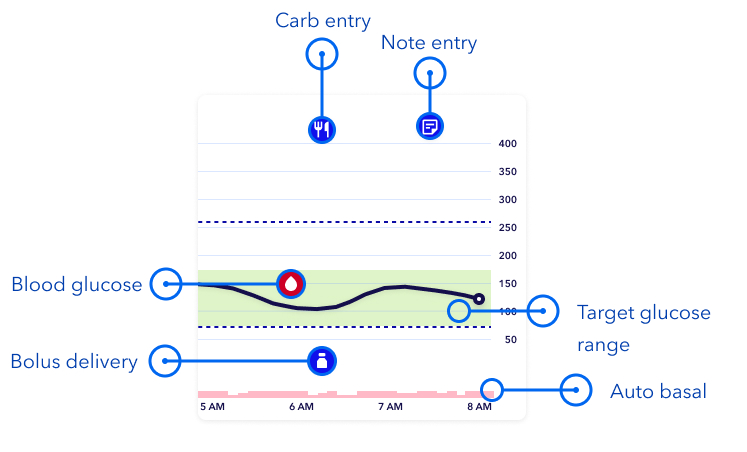
Trend graph in Manual mode
- The sensor graph includes the following information:
- Any icon on the graph can be tapped to view more details, such as a bolus delivery. You can pinch or scroll on the graph to view different time frames. The last 24 hours of glucose data can be viewed directly on your app.
- The green shaded area represents the target glucose range of 70-180 mg/dL, and the black line shows your sensor glucose readings over time.
- Boluses are shown as white vials inside dark blue circles.
- Carb entries are shown as white knife and fork symbols inside dark blue circles. These represent any bolus amounts that include a carb entry.
- Blood glucose (BG) appear as a blood drop icon.
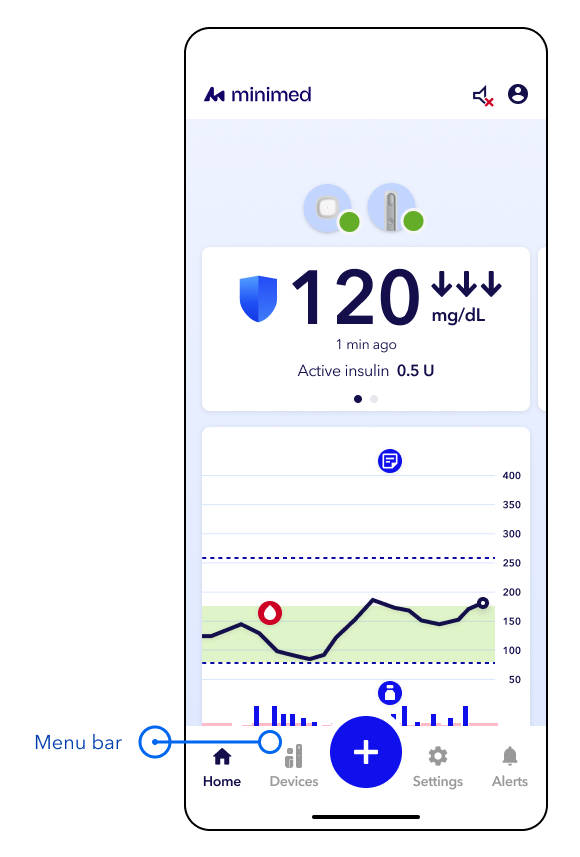
- Home — Tap this to return to the home screen.
- Devices — Tap this to view devices currently paired to the app and the device status. This is where you go to change your sensor, reservoir, and infusion set.
- Action button —Tap this to access:
- Bolus calculator
- Temp basal or Temp target
- Suspend/Resume
- Log an event
- Settings — Tap this to access:
- Insulin settings
- Alert and glucose settings
- SmartGuardTM settings
- App settings
- Alerts — Tap this to view open alerts and history of alerts.
See more detail